Design shop decoration with a few tricks that will increase your sales
Shop decoration is one of the most important factors in attracting customer attention and increasing sales. In designing the interior of small and large stores and shops, by implementing a few points, the customer experience can be improved, and this good and different experience will lead to more sales and attract more customers. In the continuation of this article, we will examine these few points.
Retail stores have a long history in the job and business markets. The decoration design of a store has a significant impact on attracting more customers and sales. Today, there are many ways to design the interior of small shops and stores. However, there are some common strategies for designing shop and store décor that will lead to more customer acquisition and thus more profit for your business.
In this article, we will discuss the basic points about the Shop decoration / interior design of the store. By applying these tips for your Shop Decoration, you can grab customers’ attention, motivate them to spin in your store, pick a product, and head to the store cash register. Keep in mind that from the moment a person steps into your store to the time he or she selects a product and heads to the cash register, the creative and clever design of the store space has a significant impact on his or her decision-making. Whether he buys a product or not and whether he goes to other store products or not depends entirely on the design of your store decoration.
Shop Entrance
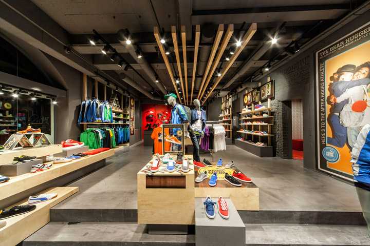
The entrance or threshold of the shop is the place that the potential customer enters after passing through the entrance door and in fact it is the first place that the customer encounters and due to the size of the shop, it is between 5 and 15 steps away from the entrance door. This area is where the customer moves away from the outside world and is transported to your store space and encounters the products you have to offer, so-called “pressure relief area”. It is in this area that the customer examines and judges your shop and guesses whether your store is expensive or cheap, whether the lighting is consistent or not, and whether the fixtures, products and colors are put together properly. Because customers in this area are in the “transition phase” they usually ignore products, signs and everything in this section.
Pay attention to the right side of the shop
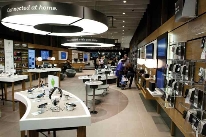
According to surveys, 90% of customers move to the right after entering the store unconsciously. This is a fact that shopkeepers are well aware of. The first wall that customers encounter after entering the store is called the “power wall”. Therefore, you should pay special attention to the design of this wall and the goods and products that you display in it.
To ensure that you have attracted the attention of customers, you should put products in this section that are important for your store in various aspects; For example, popular products or products with more profit or even seasonal products. Also in this section, you have to be creative to pay attention to the product and advertising banners and pay special attention.
Get the customer to go the route
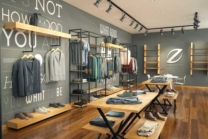
This depends on the size of the shop and its layout. So far, you have noticed that most customers tend to follow the path to the right of the store. The next step is to make sure they make their way to the store and that most of your products are visible to them. Considering a well-thought-out route for customers not only increases the likelihood of a purchase, but also provides the conditions for you to better control the flow of customers and find out where they stop most from the store and where they simply pass.
Most shops and stores have a circular path for customers to take them to the end of the store and back to the front door. In some stores, this designated path is marked with a different flooring or with a different design from other sections. This distinction catches the attention of customers and they follow the path you want.
Another important point to keep in mind is that by defining these paths, you are going to get the customer to where you want to be. So you have to offer them an impressive and different product at the desired point. For example, put a new and special product at the end of each store aisle.
Slowing down the movement of customers
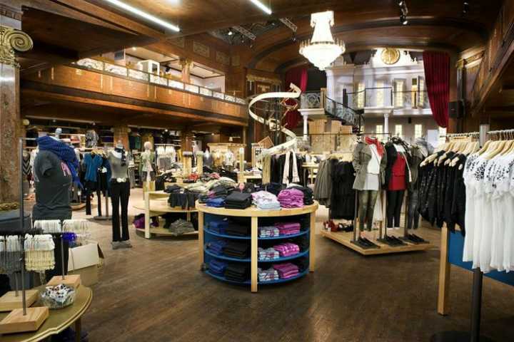
After spending a lot of time and effort attracting customers to your store, you certainly do not want them to quickly look at the goods and products and leave the store with one or two limited purchases. To prevent this from happening, shopkeepers try to slow down the customer under various headings and create obstacles that are called “accelerators”. This accelerator can be anything that catches the customer’s attention and provides a visual entertainment ring. You can do this by placing signs and advertisements, or placing specific and seasonal products in the customer’s path.
One of the methods that sellers use to pick products in the store is to put together products with similar uses and related products. This also affects the customer’s immediate purchase. You need to put your products together so that the customer understands their interaction and dependency and is encouraged to buy the related product. Align best-selling and high-demand products with customers’ eyes, and rank lower-demand products higher or lower. Another important point to consider is to change accelerators periodically, for example once a week, to keep them fresh and diverse for regular customers.
Provide convenience to customers
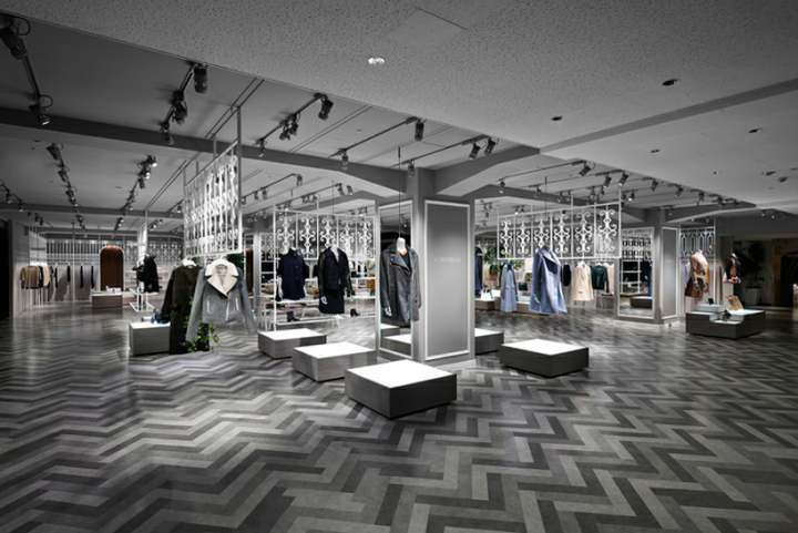
The point to keep in mind is that many customers, especially women, do not want anyone or anything behind them to get in the way and make contact with their bodies. Therefore, when picking up shop products, you should be careful to consider enough space for customers to pass so that they have an acceptable personal space around them and can move freely.
By placing chairs and benches in the store, you provide more comfort to customers; Especially for customers who have people with them or have children. Be sure to place these benches in front of your products; In fact, you should consider a place for people who are resting to have a look at the products offered. The placement of these chairs will make it easier for customers to spend more time in your shop and their companions will be encouraged to buy.
Guided to the counter
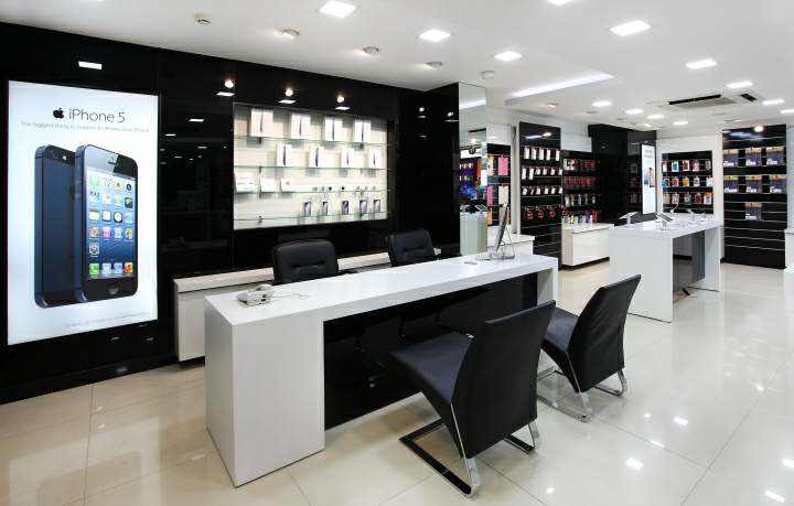
Where you place your counter, counter and card reader is so important that you have to think about it for several days and consider the different options and the advantages and disadvantages of each. The location of the counter and the cash register of the store depends on the shopping route that you have planned for the customers. So if your customers are subconsciously following your path to the right, and you also have a path for them to go to the right, turn around and turn left, it seems that the best place to put the counter is on the left. Is the front of the store. Of course, the decision to place the counter and card reader devices depends on the size of the shop and its overall design. So with all of this in mind, choose the best place for your counter.
Also, if your store has only one salesperson and no employees to browse through the products, you should place the counter where you have control over both the store and the traffic, as well as being able to respond to customers and receive costs.
Consider the following points when choosing and designing a counter location:
Choose a counter that is large enough for shoppers to place their bags and belongings on, interact with you safely, and move their products.
Pick up high-consumption products or products that are of interest to customers near the counter. By doing this, you can encourage customers to buy immediately or buy last minute.
Be polite and inform the customer of your policy in the transaction and the terms of returning the goods in various ways. By asking different questions, you can check your performance in the layout of the shop; For example, ask: “Were you able to easily find the product you want?”
Designing shop and store interior decoration is a never-ending process. In fact, you should be constantly changing it, adding sections to the store, or deleting sections to ultimately design and improve the customer experience and customer path.
Ultimately, what you need to constantly focus on and focus on is guiding the customer through the shopping process so that they have a good shopping experience from your store. Put yourself in the customer’s shoes and walk into the store. See if the elements and signs you are considering will get you to the right destination. Ask your friends, family, and employees to do the same and share your honest feedback.
Finally, monitor your customers closely; See which part of the store has caught their attention and which part has received less attention. Consider what customers typically choose and how they behave in the face of different parts of the store. With the help of this information and observations, you can make changes in your initial design. If you are flexible in designing the decoration of the shop and pay attention to the details and customer feedback, you will end up with a design and decoration that is significant both for the customers and for the seller, which leads to more profit and sales.
Retrieved from: shopify
Also read: Bedroom decoration ideas
.
[ad_2]
Design shop decoration with a few tricks that will increase your sales

